CS171: Homework 1
1. Web Development Basics
Global Hunger Index
The following table shows countries with an alarming hunger situation on the basis of the Global Hunger Index (GHI) scores from 1990, 2000 and 2014. The Index ranks countries on a 100-point scale, with 0 being the best score (no hunger) and 100 being the worst.
| Country | 1990 | 2000 | 2014 |
|---|---|---|---|
| Central African Republic | 51.9 | 51.4 | 46.9 |
| Chad | 65 | 52 | 46.4 |
| Haiti | 52.1 | 42.8 | 37.3 |
| Madagascar | 44.8 | 44.1 | 36.3 |
| Sierra Leone | 58.8 | 53.5 | 38.9 |
| East Timor | - | - | 40.7 |
| Zambia | 47 | 50.9 | 41.1 |
How GHI has progressed over the recent years
Click on the interatcive chart to see how the Global Hunger Index has changed over the recent years in the coutries with alarming hunger situation. Click on the table above to order them based on relevant parameters. The current graph has been constructed using chart.js
The Global Hunger Index (GHI) is designed to comprehensively measure and track hunger globally and by country and region. Calculated each year by the International Food Policy Research Institute (IFPRI), the GHI highlights successes and failures in hunger reduction and provides insights into the drivers of hunger. (IFPRI, 2015)
2. Visualizations Critique


Bad #1
While the design choice and color pallete is not necessarily bad (pie chart is quite minimalistic, the colors are rather neutral, legend appears clear on first glance) there are quite a few things wrong with this graph, so let's start addressing them one by one.
- The percentages don't add up to 100%. The first thing that really popped out to me was that the percentages here add up to 98% and not 100%. This is extremely confusing for the reader who would be wondering where the other 2 percent went.
- 42% part draws the attention first as the color there is darker and more intense. Even though the 42% is smaller than the 56%, the reader would see that first because of the color choice and get confused.
- The 42% part is visually larger than the 56% part. On first glance it seems that there would be more small companies than large companies. This is very confusing as the numbers don't correspond to the pie chart.
- The question this pie chart answers is unclear. It is not clear what the author of the chart was trying to convey. Some potential questions that this chart addresses could be: Are there more small or large companies? Who is the bigger employer - the small or the large companies? In what type of companies is discrimination more prevalent? In what type of companies do males/females prefer to work?
Comment: I would suggest to the author to adjust the percentages so that they add to 100, definitely make sure the parts of the pie are proportional to the numbers in them, and to clarify what the issue they are trying to address is. The source of the graph is: this link.
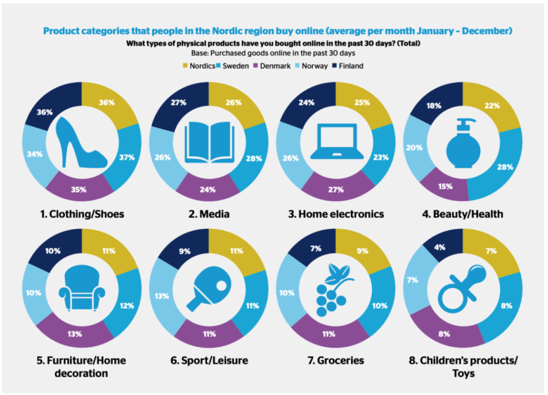
Bad #2
In this case there are some good things about this graph: the style is pretty consistent throughout all the charts, we can see right away that we are comparing various categories that people shop for online in the Nordic countries, so the question this graph is attempting to answer is pretty clear. The problems come when they tried to break up the shopping per category:
- The percentages don't add up to 100%. If you take a closer look at the graph, you will notice that the percentages don't add up to 100, which again is very confusing. Since they asked a sample of people what they bought online in the last month in each country, the percentages would never add up to 100.
- The icons in the center of the graphs are distracting The icons in the center of each graph are pretty distracting for me and completely irrelevant to the numbers and the data. This can be significantly simplified.
- Broken down by category, not by country What are we trying to compare here? What people in the different countries shop for compared to the other countries? If so it would make much more sense to normalize the percentages and see how the countries compare to one another. Yet, if we are trying to see what percentage of people shop for what within the country, we should break the graphs down by country.
Comment: My first suggestion would be to use a bar graph. My second suggestion would be to get rid of the unnecessary icons in the middle. My third suggestion would be grouping these by country and not category (we could do both and the contrast when we have a bar graph would be much clearer). If the author wants to show the difference between the countries I would really suggest normalizing the data so it adds up to 100, however that would bring up other problems (maybe fewer Finns buy electronics online than Swedes, yet the Finns spend more, or maybe 20% of the Denmark population is more than 30% of the Norway population, so still more people shop online in Denmark). The source of the graph is: this link.

Good #1
I really like this visual as it is clear and simple to understand for anyone who looks at it for more than 2 seconds. The question of how would only the non-white people vote in the US is very clearly represented in the graph. Below are some things I really like about this visual.
- Clear contrast between the colors. The contrast between the colors really helps you right away know who is voting republican and who would be voting democrat. The coloring is consistent with pre-existing notions that people have (blue for democrat and red for republican).
- The map. The map really helps me get a visual sense of who is where and how they would be voting. Interestingly enough, the distribution looks quite different from other what it looks like when we include the white people.
- The summary at the top. The most important information is very clearly conveyed at the top and you can realize what's going on at first glance.
- The question. The answered question is clear and also contained in the graph.
Comment: I wouldn't really change anything about this graph. The authors are clearly trying to communicate that the majority of non-white voters are Democrats. It really is very simple and understandable as it is. The source of the graph is: this link.

Good #2
I love this interactive visualization by the New York Times. The question is clear: should I buy or should I rent? You get to adjust the parameters and the graph gives you an analysis of whether your expectation is better off if you rent or if you buy. I find the following extremely positive:
- Bar charts. The interactive bar charts help you visualize the change that you are going to see between renting and buying. They also visualize very well the factor of future discounting, the mortgage details, future appreciation or depreciation.
- The result is clear. I love that clear result saying: if you can get the rent for X amount, then renting is better. It's clear and conveys to the user what they need and want to know.
- No unnecessary images and information. The graph is very minimalist. It shows you what you want to know in a beutiful, interactive and easy to undertand way. It's just a grpah, why complicate it unnecessarily?
Comment: Overall, I think this is an amazing tool. The only thing I might change here is putting some emphasis on the stats on the side. I would like to be able to visualize better the initial, recurring and opportunity costs. I would potentially output a different set of graphs in a different color that shows these. I wouldn't change the existing graphs in any way though. I like the minimalism. The source of the graph is: this link.

Good #3
This graph is pretty cool. While it does have creative elements that help you remember it, the figures also represent a barchart. This is why I like this graph:
- Memorability. They are comparing humans to dinosaurs, and this wouldn't have been as effective if they had just done a simple bar chart. This way the graph actually gets in your head and gives you the perspective of how much bigger the two dinosaurs would be.
- Clarity. This graph is super clear as to what it is trying to address: to show us how big the dinosaurs were when they roamed this earth. It's simple and easy to read and even the smallest kid would get it.
- No way to get confused. What do we see? A human, two dinosaurs and numbers showing the height/length of each. There is no way we can get confused as to what this graph is showing us.
Comment: I think this graph is simple, elegant, and memorable. I like the color pallete, I like the human comparison, because it gives the reader context. I honestly wouldn't add or remove anything from the graph. The source of the graph is: this link.
P.S. I'm sorry for adding a third graph: I missed in the instruction that the visuals should not be interactive so I added a second non-interactive one here. Good #2 is interactive. "Enlarge" and "Shrink" buttons likely won't work on your mobile device. They would work only on medium devices (tablets, 768px and up);